⚡How I Built a Modern Oblique Area Chart in Power BI (Using Only Native Visuals)
- Isabelle Bittar
- Jul 23, 2025
- 1 min read

A step‑by‑step guide to designing stylish, custom‑looking area charts without custom visuals
🎁 PBIX available at the end of this article!
Power BI’s native visuals can produce so many cool and powerful visualizations — and they’re often our go‑to choices because of their great performance and easier maintenance.
But let’s be honest: sometimes the default visuals don’t quite match the style of the report or dashboard we’re designing… or they just don’t look that great right out of the box. 😅

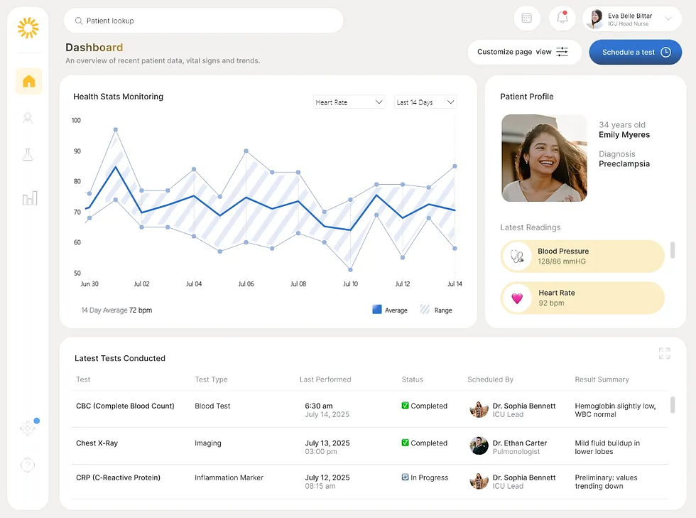
In a recent project, I came across a healthcare app that featured some really modern‑looking area charts, with a slanted, oblique pattern — like the one you see in the cover image of this article. We all know the default Power BI area chart doesn’t exactly look that slick, but after some experimentation, I managed to recreate the look using a native Power BI line chart combined with a few workarounds.
Here’s a short demo video of what it looks like in action:
In this article, I’ll walk you through how I built it — it was actually simpler than I was expecting, hope you find it too! 😎
Read the full article on Medium here: https://medium.com/the-bi-corner/how-i-built-a-modern-oblique-area-chart-in-power-bi-using-only-native-visuals-c0986d0c6753


Comments